CSS code: Konakanami 4.0


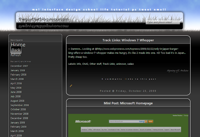
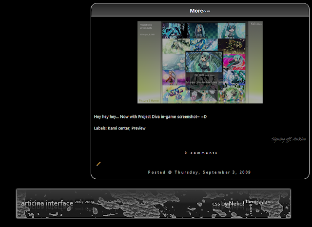
- This is what Konakanami look like after applying the CSS -

Konakanami is discontinued for a reasons; preferred Neko! over Konakanami.
Although the CSS design is elegant and simple, it is not very "forward looking' like Neko!.
____________


____________
Another canceled code is Extended2.

- Simple yet effective -
Users who are new to CSS may find it hard to customize it. Can cause some blogs to freeze for awhile as the template uses Javascripts rather then CSS.

That's all~

Changes in Neko (3.7.3.1)


- Sidebar having gradient style (Link and object)-
- Blog post title having gradient style -


- Wider border for the mimic of a .png image (fits the title gradient) -


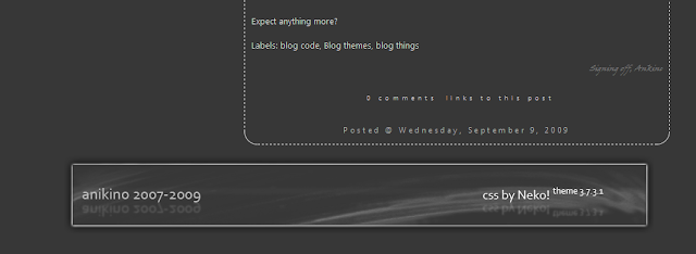
- New footer for Articina blog -

Overall it is a subtle change from 3.7.3

Track Links: Windows 7 Whopper

> Damnnn... Looking at @http://www.webpronews.com/topnews/2009/10/22/only-in-japan-burger-king-offers-a-windows-7-whopper makes me hungry. It's like 2 meals into one. =D Too bad it's in Japan... Pretty cheap too.

Mini Post: Microsoft homepage


- Agreed~ -


- Hmm... a ball? -

Sidenotes: Love the design... created by trial and error...


- The gradient... where that come from BTW it is nice. New placement of search bar.-

- The footer design is from the header (Duh), crafted out from trial and error o.O"-


Photoshop effects-Tutorial 1

Top notes: Combining filters with fx effects. Lets see.

I think this is quite nice, giving a soft tone though it's black and white.

Step 1.
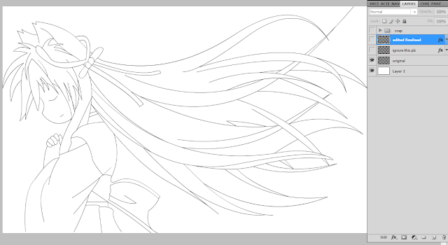
Get a line art, tracing or drawing, as long as there's lines.
I use my traced image, created by Adobe Flash CS4 (Duh, Flash user)
Since mine does not have a background (exported from Adobe Flash), the effects are obvious later on.
Recommended: Remove any background and create a white(or colors that complement) background in a DIFFERENT layer.

Step 2.
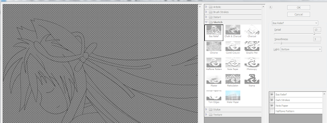
Filter gallery. Just add the filters shown in the *picture. No need for advanced tuning or anything else.
*On the bottom right hand corner.

The filter gallery excludes my white background but it's fine for me. Though the effect is (almost) not obvious to screens, well leave it as it is.

Step 3.
-From now on it's individual pictures.
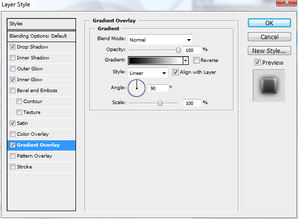
Go to the layer you are authoring on and double click to open the layer style window.
The settings are there as well.

Drop shadow

Inner glow


Satin
 Gradient (Optional)

Step 4.
Finally click Ok and poof~ it's done. Remember to fine tune if you need to.

Without fx effect, only filter.
With both filter and fx effect.

Enjoy~ =D
Looks natural and the tone is soft. This effect is made by accident, after fooling around Photoshop for 2 minutes...

First guide.
Program required: Photoshop 7.0 and above.
Program used: Photoshop CS4 Extended

Fooling with Photoshop since 2004
Self-taught too. =D

Mini post: Adding PS effects.

Just one of my old traces with simple effects. Nothing much at all. No color, no fancy gradient, just filter and blending effects.


- Looks natural. Thanks to special tweaking of shadow effect. -